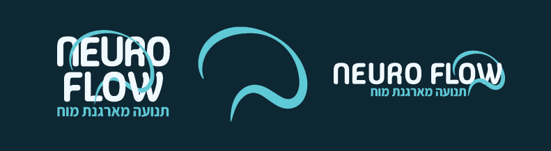
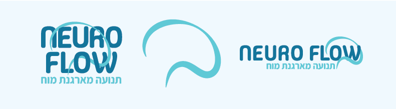
Neuro Flow is a groundbreaking neurological training program rooted in scientific research, designed to help people take control of their lives by strengthening neural connections in the brain. Focused on stress relief and emotional regulation, the program empowers users through structured, research-backed exercises. My work with Neuro Flow involved building a complete brand identity from the ground up, including logo design, a cohesive color palette, engaging social media visuals, and a user-friendly website. The goal was to create a brand that reflects both the science behind the program and its transformative impact on people’s well-being.

UX | UI

UX | UI

BRANDING

BRANDING

UX | UI

BRANDING

For the UX process, I researched similar neurological training programs to understand industry standards and user expectations. My focus was on presenting complex scientific information in a clear, approachable way to prevent users from feeling overwhelmed. Through thoughtful information architecture, intuitive navigation, and clean design, I ensured a seamless user experience that makes engaging with the program effortless and effective.

Colors

I chose this palette to create a calming, focused experience while maintaining a sense of trust and scientific credibility. ensuring the design feels both welcoming and research-backed.

For the UI, I combined UX research with a clean, structured design to ensure clarity and ease of use. Thoughtful typography, intuitive layouts, and a calming visual hierarchy guide users smoothly through the site, making complex information accessible without feeling overwhelming.

Let’s work together

Reach out to connect

Reach out to connect

Reach out

to connect

Dream Watson © 2025. All rights reserved.

Designed by Dream Watson, Built by DimaOdin.com

Dream Watson © 2025. All rights reserved.

Designed by Dream Watson, Built by DimaOdin.com

Dream Watson © 2025. All rights reserved.

Designed by Dream Watson, Built by DimaOdin.com